


Hello! Before anything else, I want to say a massive thank you for your brilliant, thoughtful and encouraging comments on my last post about not buying new clothes throughout 2020. It is heartening to know that so many of you are doing similar. Also, I am very aware that a choice like this - and decluttering the home too, for that matter - is one of privilege. To have enough clothes that we can choose not to buy new, to have such a surfeit of belongings that we feel the need to regularly clear out clutter - this comes from a place of privilege, and I recognise that. I also hear what you're saying about the cost of fabric and yarn when you want to make your own clothes, and how expensive that can become. It's something I weigh up carefully myself, buying fabric on sale and asking for yarn store vouchers for birthday and Christmas. Thank you for sharing your thoughts and views with me.
*
Anyway, we've been doing a bit of decorating and I am very excited to show you the results. The kitchen-diner has needed a lick of paint for some time and John recently spent a week long holiday (ha!) painting, sanding and sawing to give the room a bit of a lift. This was the previous colour, (Empirical Grey by Valspar) which we only painted on one wall.

I was very keen that the whole room be white but thank goodness John talked me out of it.

Instead we went for Pleat by Little Greene paint*, a sort of green-blue-grey depending on the light and time of day. I was very worried that the room would be dark but it's north-east facing with large windows so gets pretty good, consistent light throughout the day so it's fine. I did however buy a set of Cable and Cotton lights in white which, when lit, give a much warmer glow to the whole room, very necessary on a gloomy January afternoon.

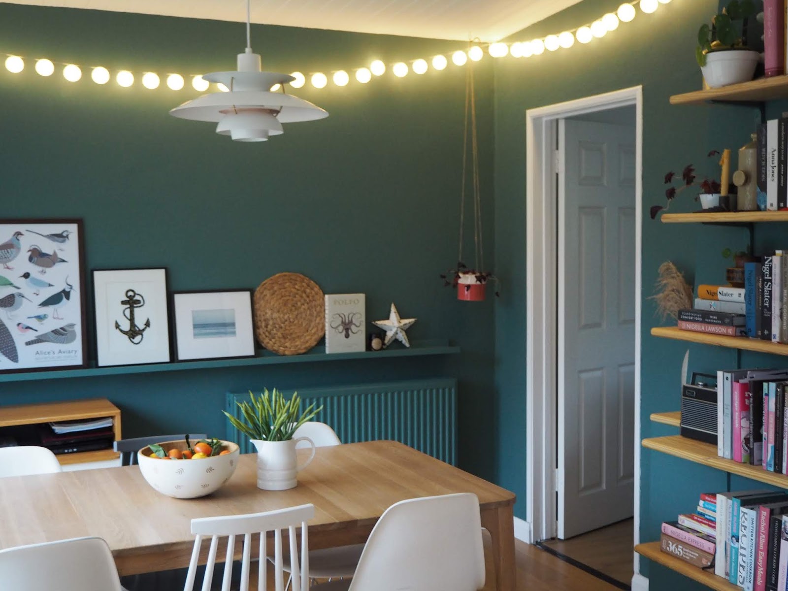
As well as buying emulsion for the walls, we bought a one litre tin of satinwood for the metal and wood, painting the radiator in the same colour. John made this fabulous picture rail to my specifications, designed to run the whole length of the wall. Similar to the IKEA picture ledges I love so much, it's deeper so can hold small vases or candlesticks as well as pictures and prints. It's made from MDF and painted in the Pleat satinwood paint.

I had a lot of fun arranging prints (these were all above our bed before) alongside books, magazines and other bits and bobs.

As you can see below, we continued the new paint colour around the corner and onto the wall which leads into the living room, which had previously been white.

This is what it looked like before:

It was completely John's idea to continue the paint colour and I have to hand it to him, it looks so much better.

I just love the shelves so much. We kept the same white brackets that were there before but John primed and painted them in the same paint as the radiator and picture ledge so that they almost disappear into the wall. We said goodbye to the cheap white contiboard shelves that were there before (chewed by Ziggy as a puppy) and put them in the garage where they will get another lease of life, and bought some wood from our local timber yard.

It is pine window sill board with a rolled edge, which I like because it looks a bit more finished. John cut it to size at home, then sanded it and gave it a coat of Danish natural wood oil.

The wood adds so much warmth to that corner of the room and I had a lot of fun faffing with books and plants, seeing which colours work against the deep green-blue.


As much as possible, I have tried to use things we already have; the spindle backed chairs below, bought on eBay a few years ago and painted, were previously upstairs at my dressing table and the desk in the spare room. I fancied a change so I swapped them around, and like the white against the new paint colour. All the other pictures, curtains, books, plants, pots etc we already had and I just love how refreshed they look in a different room against a newly painted wall. We spent money on paint, wood, MDF and the new set of fairy lights.

This is the view from the kitchen door.

I smile every time I walk into the room.
* This was my first time using this paint and I like it a lot. It's not cheap but the quality and depth of colour are incredible. We only needed two coats to paint over both the grey and white walls, meaning we could buy a smaller pot. I know from experience that a cheaper brand would have needed three coats. I would definitely use them again if I wanted a strong colour but probably wouldn't bother if I was just painting pure white.
Beautifully done Gillian, it's a lovely room. CJ xx
ReplyDeleteI love it! Your husband's idea of painting the other wall as well works wonders in bringing everything together even better than before. It was a beautiful room before (I liked the grey wall paint as well) but this fresh look suits it perfectly, too, and the wooden shelf boards are great.
ReplyDeleteThe new colour is more uplifting than the grey and really shows off your artworks well. Can I just say how stylish the new wooden shelves look too and such a good use of the wall space. For a small outlay you have a whole different look by bringing in items from other areas too.
ReplyDeleteIt looks gorgeous, a beautiful colour to set off all your 'bits'. And yes those wooden shelves really do warm up that corner. I love that the little piece of wood has also been added to that tiny wall ledge, it just finishes it off so perfectly.
ReplyDeleteFabulous! It is so smart and yet inviting.
ReplyDeleteWe are also Little Greene fans.
I love it! The paint, the wood, the lights, everything. You have a wonderful
ReplyDeletesense of design.
So pretty! Where did you move your embroidered hoops? What is above your bed now? More rearranging? You will show us when it is all set! I look forward to it! thanks!
ReplyDeleteNorth and grey wasn't a good combination, your husband was so right. Looks so much warmer now.
ReplyDeleteLove your new look dining room, Gillian! The wood shelves look beautiful against the green paint :)
ReplyDeleteA wise decision to continue the painted walls, makes it look like a more complete room rather than a corridor. Love the new shelves.
ReplyDeleteThe room looks so nice. What a wonderful colour! I also love your pretty yellow tea kettle on the top bookshelf!
ReplyDeleteLove everything about this!
ReplyDeleteBeautiful and inspirational. Thanks for the fun post.
ReplyDeleteA gorgeous room...
ReplyDelete