Tuesday 29 April 2014

A Crocheted Chevron Filofax Cover


I love my filofax. I realise this probably makes me really uncool but I don't mind and every autumn - out of habit as much as anything - I buy a new set of diary inserts and that commits me to using it for another year. I just can't get on with using the diary on my phone; I like to see it all laid out before me, I like to have the pen in my hand while I look over my day, flicking through the pages, counting the weeks.

But my filofax is not pretty. No, it is a brown leather one, old and dull, battered and worn. There is a large ring mark left by a hot cup of tea on the back, and a stain from a time when a pear got squashed in my bag about eight years ago. My grandma gave this to me one Christmas maybe ten or twelve years ago and I'm very attached to it, but it was starting to look shabby.


Something had to be done, and once the seed of an idea of making a cover was planted in my head, that was it, I was off. But goodness me, this was a project and a half, and one I very much wished I had a pattern for. I googled "crocheted filofax cover", I looked on Ravelry, but there was precious little out there. (Also, on a side note, so many crochet patterns and projects are so fussy, girly and country in style. Yarn lovers like modern pattern and colour too, not everything needs a rainbow of colours or a flower stuck on it, although that's nice too sometimes...just saying.)

So I just made it up as I went along really, imagining something like a notebook cover with a flap for the fastening, and decided to use a chevron/zigzag pattern for which I found an excellent tutorial here at the blog Meet Me At Mike's. And what an inspiring blog that is, hurrah for some fresh, modern, un-fussy crochet!

Anyway, it's finished now (it basically took me the entire Easter holiday) and luckily I LOVE it - the colours, the pattern, the neat little stitches. I have a real thing about chevrons lately and have started another project which I'll share soon, I'm only six rows in.

Carry on reading if you're interested in how I made it. It's not a tutorial as such, more me sharing how I did what I did, with photos.


************************************


First of all, the essentials. I chose cotton yarn mainly because I had a lot of it already, and I wanted it to be hard wearing and washable. I used this brand, which I really recommend - it has great depth of colour, doesn't split much and it well priced:


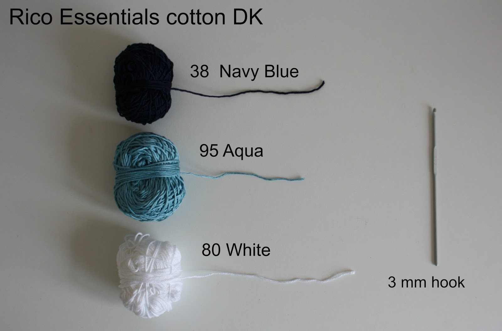
I wanted a very closely woven, dense fabric so that when it was stretched tight over the leather you couldn't see the brown showing through. This made it quite hard work to crochet - I had to really force the hook into the stitches sometimes - but I'm glad I made it this way, it feels sturdy and less likely to snag. 

Ok, once I'd decided on the pattern and yarn, I needed to make it fit the filofax. I adapted the pattern so that my foundation chain was long enough for my project. However, this being the first time I'd crocheted a chevron, I didn't anticipate how much it would shrink back as I worked the rows. It quickly became clear that it would be much too short, and I had to start again, adding another peak to the row of zigzags. Duh. 


Obviously, if you're working in stripes or granny squares, this wont happen, and it should be much easier to gauge how wide you need to make it. Once I was happy with the sizing, I crocheted away until I had a long strip of fabric that I thought I could wrap all the way around my filofax, with enough for flaps either side. Or so I thought...

I suddenly realised that, since my filofax has a flap with popper fastening, I would need to accommodate this into my design, somehow creating an opening into the chevron pattern. This made my brain hurt, but I figured it out. It's hard to explain, and I will do my best: what I had to do was "fill in" one of the dips or valleys in the zigzag so that it had a straight edge. I found a great tutorial here which helped with that a lot. The arrow highlights the area I filled in.


Then I needed to continue back into my chevron pattern in the next row, or else the rest of the pattern would be off. So, above my "filled in" area, I created a chain, a sort of temporary foundation chain, of the number of stitches I needed to make a down-up section, and attached it firmly to either end of my little filled in area.

Then I crocheted along as I had been until I reach my new bit of foundation chain and, instead of working into the tops of the previous row's stitches, worked into the chain instead, and then carried on into the next part of the fabric. This worked in so far as it gave the chevrons an uninterrupted pattern, which is great, but it also gave me a kind of flap, which you can see below:


 But this flap just gets tucked inside the cover at the end, so it's fine. 

I carried on with my pattern until my piece of fabric was the desired length to go all the way around the filofax with room for flaps at either end. At this point, I darned in the ends and then gave the whole thing a border of two rows of double crochet, just to make the edges nice and tidy.


Now for the cover for the strap. I joined the turquoise colour to the straight edge of my "filled in" valley in the zigzag and then crocheted a strip of fabric that was long enough to cover the strap and wide enough to wrap around it.


Next came the joining it together part. I laid my piece of crocheted fabric flat, placed the filofax on top, and pulled the fabric around it until I was happy it was all equal and straight. 


Then, using safety pins as stitch markers, I placed these at the points where I wanted to join the fabric together. 


I took a lot of care here to count the stitches and make sure they matched up. 


Instead of sewing, I crocheted the two parts together using double crochet stitches, then continued those across the middle section, then carried on joining together on the other side. This gave a nice continuation of the border and a firm edge.

Last of all, that pesky strap. I inserted the filofax into it's cover (it fits, phew!) and then stitched the strap tight all around the strip of leather. You can still take it on and off, but it's not baggy. 


And then the fastening. I had no luck with poppers (press studs) and so went off to my local haberdashery in search of velcro. Honestly the women in there know everything. They are officially amazing, slightly scary, but mainly amazing. When I showed them what I was making one of them suggested a magnetic handbag fastener which is a million times easier to fit than a popper, so that's what I did. When I was happy with the positioning I inserted and fixed it, then finished sewing around the last bit of the strap.


I'm really proud of how I got the strap to look, and that fastening. I'm proud of all of it in fact, it was a steep learning curve but sometimes that's a good thing.

And this is what it looks like from the back...


...and the front.


Sunday 27 April 2014

Mixed Media


This weekend has mainly been about making things with Hama beads, banging nails in the wall and moving pictures around. Lots of time has been spent hanging small groups of small things on the walls, in various different parts of the house. Faffing about. Pottering.

I still find those Hama beads endlessly appealing and inspiring; the grid, the counting - it's like cross stitch. I had fun first drawing a Dala horse onto a grid on paper, then recreating my image with beads. The kids love making things with them, and our "pictures" are quick to make and so bendy, wipe-able and generally indestructible as to make them almost useful. We've got quite a lot of "mats" now.


Angus claimed the Dala horse and I hung it on the wall in their bedroom, in between Darth Vadar and Angus's drawing of a diplodocus.


It's not often I am drawn to a Cath Kidston print these days, but I always liked her flamboyant rose motifs and I especially like them in this pixelated form. It makes me want to make a giant patchwork quilt made up of single-colour squares, one huge version of a kitsch rose.

This was an enjoyable little project and they do make handy mats to go under wet vases of flowers. (The other mat depicts a floral cross stitch motif from Alicia Paulson's book Embroidery Companion.)


The collection of pictures in the dining room has been bugging me. I like them all separately but I think they are not right at the moment. Not wrong, but just not quite right. 


Too much white and paleness on the left hand side, maybe. Something needs to go above the lamp, and I'd like to continue this display over the whole wall, maybe even above the door to the kitchen, just to the right of the lamp, but the dining room is a darker part of the house and I don't know if it might all start to look a bit cluttered. 


But there is one gorgeous new addition to my picture wall, and that is this hoop-framed embroidery:


Isn't it sweet? I was lucky enough to win it in a blog giveaway held by Helene of Petite Laine. It arrived over Easter and what a parcel of goodies it was; bunting, stationary, postcards, notepads - so many lovely things.


I liked the look of the fabrics in the bunting straightaway but when I opened it up I realised it said "hello"...


So sweet. Thank you, Helene, I love it, and you are very talented and generous.


Right, I am off to put the hammer away. It's time to step away from the picture walls and leave them be for a while.

Wishing you all a lovely week. 


Thursday 24 April 2014

The Colour Collaborative: April - Tradition


Tradition: the transmission of customs or beliefs from generation to generation, or the fact of being passed on in this way.

A couple of years ago I had the good fortune to inherit some really quite wonderful old collections of household items, things I really cherish. 


The first was a dinner service - "Ode" by Denby - which belonged to my mother in law. She and John's father were given it as a wedding gift when they married in the seventies but she'd stopped using it some years ago and, knowing how I love so many things manufactured during this period, she kindly offered it to me. Plates are plates, I know, but I take a bizarre satisfaction in having matching plates - it makes me feel like a proper grown up. We have dinner plates, side plates, cake plates, cereal bowls, soup bowls and serving dishes, all of which we use every day. In the loft, I have boxes containing a full coffee set - cups, saucers, sugar bowl, the lot - egg cups, vinegar bottles, salt and pepper pots  - yes, all in Denby Ode, all matching. Those we don't use, and don't have space to store downstairs, but I can't bring myself to put them on ebay, I love them all too much. 


You see, these plates are not just plates. They speak to me of family, of memory, of tradition, and they celebrate the everyday ritual of sitting down at the table together and sharing a meal. I want my children to associate these plates with their childhood in the same way that John associates them with his. (Also, they can go in the dishwasher, a definite bonus.)

And then we have my Grandma's cutlery set. The family silver.

These are the soup spoons which have not been used for some years and yes, they need a good polish!

It's solid silver, apart from the knives which have silver handles and stainless steel blades. It's heavy. The forks and spoons have a solidity and weight to them that you just don't get any more, they feel substantial in your hand. It came in an old canteen, a wooden box lined with teal velvet, with foam inserts for each knife, fork and spoon. Unfortunately the foam is disintegrating before my eyes, (it's some decades old I think) leaving a fine dust on everything it touches, so I can't store the cutlery in there any more. But I can't bring myself to get rid of it, it's too full of history and memories.


This cutlery is not for every day, it's for high days and holidays. It's for "best". It can't go in the dishwasher, for starters, but must be washed by hand. It requires attention, careful polishing and storing. It's a bit precious, to be honest, but that makes me appreciate it all the more. My grandparents would not have used this every day (the cutlery stored in the kitchen table drawer was for that) but I remember my Grandpa getting out this canteen and carefully laying the dining room table for Sunday lunch with the best cutlery, the good china, the crystal glasses. (It was always his job to set the table and when, as children, we stayed the night I would watch him lay the kitchen table for breakfast before they went up to bed, so that it was ready for the morning, with mats, napkins, cutlery, egg cups and bowls, proper bone china tea cups and saucers - do people still do things like that any more I wonder?) 


But, oh, when I get out this cutlery and set the table, I cannot tell you how happy it makes me. There is comfort in handling things which were treasured by much loved family members who are no longer with us, comfort in cherishing the things they cherished. We use it at Christmas and Easter, and whenever we have friends over and I want to make the table look pretty. It probably only gets used four or five times a year but that's ok, I plan to continue using it forever. 


So, colour. It hasn't escaped my notice that I've talked about everything but colour here and that's because there isn't a whole lot of colour going on. Brown and grey. Beige and silver. But, that's the beauty of these things! Timeless and versatile, these plates and knives compliment everything else going on around them. I added a white table runner here, but I've got a hot pink one too and that works just as well. The colour comes from the season and the ocassion; the flowers, the food on the table, the wine. The job of the plates and cutlery is to be a classy showpiece for everything else, to be neutral and tasteful in the background, not shouting. We'll leave the shouting to the children who don't want to eat their peas, and to the grown ups who had too much too drink.


What is The Colour Collaborative? 


All creative bloggers make stuff, gather stuff, shape stuff, and share stuff. Mostly they work on their own, but what happens when a group of them work together? Is a creative collaboration greater than the sum of its parts? We think so and we hope you will too. We'll each be offering our own monthly take on a colour related theme, and hoping that in combination our ideas will encourage us, and perhaps you, to think about colour in new ways.

If you'd like to read posts by the other Colour Collaborative bloggers, please follow the links below:

Annie at Knitsofacto
Sandra at Cherry Heart
Jennifer at Thistlebear
Claire at Above The River

Tuesday 22 April 2014

Photography Tips For Bloggers: Part Two

Hello! Welcome back to the second half of my photography tips, hints, ideas, whatever you like to call them. I was so touched by your response to part one, thank you for your comments. I hope you like this post as much. Many of you mentioned that you had to use your phone for blog photos, and lamented the quality of the images. I think it's worth emphasising that you do not need a fancy camera to enjoy taking photos for your blog (or photos for yourself, for that matter) and that the important thing is that you enjoy what you are doing, that you enjoy taking the photos, and I think that this will be conveyed in your images.

*****

7. Editing

By this I mean playing around with an an image on the computer by using a package or a website like Photoshop, PicMonkey or Pixlr. PicMonkey is the one I usually use, and certainly the one that I am most familiar with. It's largely free - the functions I use are - but you can pay more to access extra filters and effects I believe. I tend to use it to to correct wonky horizon lines, crop images  or sometimes, during the winter, add warmth to the light and colour settings if I took the photos on a very bleak day.

You can have tremendous fun by uploading your photos and playing around with the filters that are there, or creating your own effects by playing around with contrast, colour saturation or focus. I changed the effects of the leaf skeletons below by going into "Sharpen" and moving "sharpness" and "clarity" to their maximum settings, for example.


I'd really recommend you play around on it and experiment. 

The other thing it's great for is creating collages. All the collages you see on my blog were put together using PicMonkey. Sometimes they can give a feel or flavour of something in a way that one single photo can't. 


Sarah at Mitenska uses collages very successfully to capture the feel of an event, day or holiday to great effect, such as here, rather than showing us lots of individual photos. They become pieces of art all of their own. I think she also uses filters really successfully, and they work well because her original photos are so good.

Annie at Knitsofacto is a very gifted photographer, and she recently put together this excellent tutorial for using colour in PicMonkey collages. But I'd highly recommend a look at all Annie's photos, she has a unique talent. (in my humble opinion!)

*****

8. Be Observant

I find I often wish I had my camera with me when I see something I like the look of, or something I want to capture. Often it's a view or a sunset, but sometimes it's something more mundane. My eye is always drawn to interesting or unusual shadows around the house...


...or reflections...


...or the way light is refracted through glass.


Things like this fascinate me. You might say that images like these don't really serve any purpose, but if they catch your eye or pique your interest, then it's a challenge to try to capture them on camera in the best way you can, and rewarding when it works out. Scenes like these challenge me and make me more observant, and I like that. Also, they remind me how much beauty there is in the everyday, and that's worth remembering.

I think that these four bloggers all have a genuine knack for capturing the beauty in the real, everyday, even mundane things they see in the landscapes around them. 

Leanne's love of her local Cornish coastline comes over time and time again, such as here and hereJennifer's love of homemaking, of her crafts, her garden and ever changing local desert landscape is a rich vein running through her blog. CJ has a gift for capturing her local area, her allotment and her life with three small boys, not to mention a very wry sense of humour. And Sue's talent for spotting and documenting the happiness there is to be found in simple pleasures - food, fresh flowers, sunshine, knitting, her quince tree - is a joy to behold. (Also - if you don't already know Sue's blog, do have a browse through her recipe page - you wont be disappointed.)

*****

9. Break the rules 

I always thought that all photos had to be taken with the sun behind you. I'm sure we all remember those family photos taken outdoors: a group people stand in a row, squinting into the sun, with the long shadow of the photographer in the foreground of the photo. 

But guess what? You can take photos into the light! It can create wonderful, dramatic, sometimes magical effects. (But please, be careful, don't blind yourself.)

These two shots were taken on the beach where the reflection of the sun on the water created extra light. I know that these are not technically good shots, but when I look at them, straightaway I remember that feeling of the bright winter sun and the cold wind


These two were also taken in the winter, proof that the low, bright, cold winter light can be as photographically rewarding as the golden light of summer.


These three were taken into the setting sun in the summer months, creating a softer, warmer effect, and wonderful rainbows on the lens.


*****

10. Take lots of photos. 

Then take some more for good measure, then delete most of them. The joys of digital photography! Or, you can get your husband to take lots and then go through them until you feel there is one that does not make you look like an idiotic poser. (John taking a photo of me is an unhappy situation not unlike when one of us is navigating while the other drives; me tetchy and uncomfortable, him not really sure what I want or what he is doing, both of us unsatisfied.) I loathe having my photo taken and am now wondering why I've shown you twelve photos of me. You can laugh, if nothing else.


If I'm trying to get a good photo of, say, this cowl, then I'll take far too many and delete about 90% of the ones I take. This works for me because I've learnt to edit quickly and I'll whizz through them, deleting or not, until I'm happy with what I've got. Here, you can see me moving it in and out out of the sun, arranging and re-arranging until I was happy I had some clear photos that faithfully reproduced the colour of the yarn and showed the texture of the stitches.


*****

11. Go Large

I would advocate uploading a bigger photo onto your blog, if you can. This is purely my own personal preference, but I would suggest using the large or extra large settings. It's as simple as clicking on the photo while you're composing your blog post, and then choosing your size preference. Here is the difference for you to see...

Small:


Medium:


Large:


Extra Large:


One of my absolute all time favourite blogs is Posie Gets Cozy. Alicia always begins her post with a long series of images which fill the screen and almost stand alone to create a post of their own, like a visual story ready to be told, and that's before she even starts to write.

*****


12. Avoid Using Flash

It's the middle of winter. You left for work in the dark and returned home in the dark, and your weekends are most likely filled with a mixture of hobbies, chores, seeing friends and family, getting out and about, and having fun. That leaves precious little time to take any daylight photos and so, if you want to photograph something you've created, you are left with the option of electric light. It doesn't always show colours accurately and your camera will most likely want to use the flash, as it will tell you there is not enough light. This one is up to you - try the electric light in different rooms (maybe the bright spotlights in the kitchen give too much shadow?), try experimenting with and without flash, just snap away and see what you come up with. Try using Picmonkey to add a little more light into the photo if you think it needs it. I don't have any solid advice here, I am sorry! What I would say is, with electric light, go with the low light levels, go with the interesting shadows and effects it can create, rather than trying to control it too much.


However, in daylight, it's a different matter and I'm very wary of using the flash on my camera during the day. I'm always amazed at how keen my camera is to use the flash! It decides there is insufficient light constantly, so I generally switch it off. I took the photos below on a bright day and was surprised that camera still felt flash was needed. The two below were taken with the flash turned on and I think the glare spoils the depth of the photos and gives an unnaturally bright, false look.


These were taken with the flash turned off. Yes, they are very slightly darker, but I prefer them. It's a matter of taste I think, but my preference is not to use flash unless it's really necessary.


*****

Well that's it. I've enjoyed putting these posts together enormously, thank you for indulging me. Snap way, practice, and most of all have some fun.